¶ Maps Content
There is a wealth of data available within the Maps product and many thousands of maps. Maps or charts are constructed in a number of ways and with different purposes. This page goes into some detail on some of these charts, how they're constructed and what they're usually used for.
¶ Operational/Ensemble Models
Information on the models including spatial and temporal resolution, how often they run and where they are available can be found in these tables.
What is the difference between the operational (deterministic) runs and the ensembles?
A weather forecast model uses current observations to initialise the model. These include satellite data, automatic weather stations, radiosondes, buoys and more. In theory, the more observations that are included, the better the forecast model should be. However, it’s impossible to record every inch of the atmosphere, therefore there is some interpolation between stations where there are no observations. Many global forecast centres with run an operational (or deterministic) model with a best-guess of the starting conditions, and run at high resolution.
Alongside the deterministic run, may models are also part of an ensemble suite. Many ensemble members are run with slightly perturbed intitial atmospheric conditions to cover uncertainties in the observations. As a result, the ensembles cover a more probabilistic view of the forecast period, while being less vulnerable to run-to-run changes.
Why are there differences between the forecast models?
Model differences arise due to different physics, parameterisation schemes used and differences in the perturbation of initial observations. For example, the models will make slightly different assumptions about how a convective cloud forms. Chaos theory is the reason why small differences at the start can arise in much bigger differences between the models, normally notable from 4-5 days ahead.
For a complete introduction into weather models and how they work, please consider our training courses of those in the energy market: https://energytraining.metdesk.com/
Hurricane Strike Probability (EC EPS only)
This product shows the potential tropical cyclone activity at different time ranges during the forecast. It includes both tropical cyclones that are present at analysis time and those which may develop during the forecast. The maps show the "strike probability" based on the number of ENS members that predict a tropical cyclone, each member having equal weight. The strike probability is the probability that a tropical cyclone will pass within a 300 km radius from a given location and within a time window of 48 hours. This provides a quick assessment of high-risk areas allowing for some uncertainty in the exact timing or position. The strike probabilities are generated for three storm categories; tropical depressions(> 8 m/s), tropical storms (> 17 m/s) and hurricanes/typhoons (> 32m/s). Plots are available for the whole globe and for seven sub-regions (main basins). Verification of the strike probability product is available here by basin and step.
_1.png)
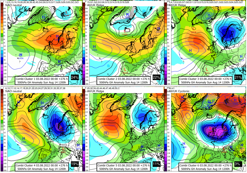
¶ Clusters
Cluster maps are designed to reduce the required time to analyse all members of an ensemble system, by sorting the members into up to 6 groups based in similar forecast outcomes. Each of the clusters is also given a probability, not just from the number of members in each, but by how close each of the members are to each other. Clusters are available for a number of weather parameters from the GFS, ECMWF and CMC ensemble systems. The total number of clusters can vary depending on the uncertainty/spread in the ensemble system, especially when the forecast lead time is long.
¶ COMBI Clusters
For 00z and 12z runs, the GFS ENS and ECMWF EPS members are combined to form a grouped ensemble from which clusters are then produced.
¶ EC Method Clusters
This cluster product from the ECMWF shows scenarios from each cluster in the form of specific ensemble members rather than average of all members in a cluster. This is different to the MetDesk method which takes an average of all the members within a particular cluster. For each cluster scenario, the ensemble member within that cluster which best describes the scenario is shown, based on 500hPa Geopotential Height. The number of ensemble members within each cluster is displayed on the maps. The clustering method is performed over 4 sections of the forecast trajectories: 72-96h, 120-168h, 192-240h and 264-360 hours. Maps are made available at 12 hourly intervals for 72-96h, then 24 hour intervals from 120-216h, then 48 hour intervals thereafter. MetDesk improve on the product offered by ECMWF, by making available for multiple elements, including 2m temperatures and 10/100m wind. The clustering data is released in 2 parts, first part (containing 3 time sections) when the ensembles have reached 240h and the second part (remaining time section) when the ensembles have got to the end at 360 hours. For each cluster group, the climatological regime is defined from four set regimes: blocking, postitive NAO, negative NAO and Atlantic ridge (see below).

¶ Aggregate Clusters
Similar to daily/12hrly clusters, but these provides groups (and hence possible outcomes) for week-long periods (7 days) based on ensemble data within the run.
_1.png)
¶ Aggregate Maps
Another useful way to display and use data is to aggregate it over a certain period, whether it be a daily, weekly, or monthly. This enables weather data to be aligned to trading periods and to iron out short term fluctuations for those interested in periods covering several days or more. Along these lines, the volatility that models can show, both spatially and in terms of the timing of weather changes, can be partly made more stable when considered in aggregate form.
_1.png)
¶ Model Compare
This section enables users to compare different model forecasts (EC, GFS, EC EPS average and GFS ensemble average) in a quadrant of maps for a variety of parameters. Users can create their own versions of these maps using the new dashboard feature. Users can also compare the difference between the selected model run and the previous model run for a variety of different parameters. The delta is shown both numerically and in a colour gradient to draw attention to large model run swings. Model deltas are available for GFS, ECMWF Operational, GFS Ensemble, EC EPS and CMC models.
¶ ECMWF Extreme Forecast Index (EFI)
From the ECMWF, this set of products is designed to highlight geographical areas where certain parameters (e.g. temperature, precip, wind) are running (or forecast to be) anomalously high or low. This allows the user to pick out potential extreme events very quickly, anywhere around the world. The maps are available with global coverage and a range of parameters, including a multi-parameter view. Aggregate maps covering 3, 5 and 10 day periods are available for 2m temperature and precipitation.
_1.png)
As well as showing the EFI as coloured shading when above certain thresholds, the maps also have black contours depicting the Shift of Tail (SoT), a parameter which attempts to describe how extreme a particular event is.
For more information on the methodology used by ECMWF to create both the EFI and SoT, see the official documentation here.
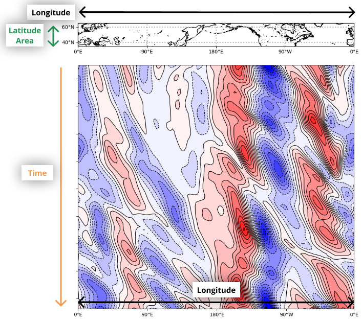
¶ Hovmöllers
A Hovmöller diagram is a way, commonly used in meteorology, to plot atmospheric data, focusing on atmospheric cross sections or the temporal evolution of certain parameters.
Trading Weather now has a large selection of these charts available, covering different parts of the globe and different meteorological parameters. One example of their use is tracking the interactions between the weather conditions in the troposphere and the stratosphere, particularly relating to the polar vortex.
These diagrams are found in two formats:
.png)
Plot Style 1:
- x-axis -> Time
- y-axis -> Pressure / Altitude level
- Averaged values through two northern hemisphere latitude zones: 45-75N and 60-90N, across the full range of longitudes
- Plots temperature, temperature anomalies, zonal wind, zonal wind anomalies or geopotential height anomalies
Plot Style 2:
- x-axis -> Longitude
- y-axis -> Time
- Averaged values across a latitude zone (several available) at specific geopotential height levels (e.g. 10hPa, 200hPa)
- Plots temperature, temperature anomalies, zonal wind, zonal wind anomalies or geopotential height anomalies
An example of the second type of these Hovmöller diagrams is shown below. The map to the top shows how the data on the diagram relates to areas of the globe. Effectively, the value of a parameter (whether it be temperature, wind etc) is plotted with time (y-axis) for each longitude value, averaged over certain latitudes (in this example between 40 and 60 degrees North). Note that our plots are often centred around 0 degrees longitude rather than 180 degrees as shown in this chart.
¶ Teleconnections
Our online training course on teleconnections can be viewed here: https://energytraining.metdesk.com/
¶ Madden Julian Oscillation (MJO)
This section visualises model interpretation of MJO activity from a selection of operational and ensemble models. Maps for outgoing longwave radiation and precipitation are shown, in addition to phase diagrams for the ECMWF and GFS operational and ensemble models.

The MJO phase diagrams are derived using the method laid out in Wheeler and Heedon 2004, without the SST anomaly removal. This is similar to the method used at NOAA on the Dynamical Model MJO Forecasts website. The reasoning for not removing the SST anomaly (or ENSO signal) is outlined on the NOAA website (http://www.cpc.ncep.noaa.gov/products/precip/CWlink/MJO/CLIVAR/clivar_wh.shtml#meth).
The data used in the MetDesk analysis is somewhat different from that in the Wheeler and Heedon paper.
- The 120-day mean is produced from ECMWF data rather than NCEP data.
- The mean and first three harmonics are calculated using ERA interim rather than NCEP reanalysis and satellite observed outgoing longwave radiation (OLR).
- The OLR used throughout the analysis is taken directly from the models, rather than via satellite.
The above changes to the method mean MetDesk is able to build the phase diagrams straight after each model has finished, currently giving about a 12 hour advantage over the NOAA phase diagrams and meaning they include the 00z runs along with the 12z runs. There will always be differences between the MJO forecasts of different intuitions due to the data used. Variations in methods are equally valid. The fast MetDesk build should provide a large advantage when there is a significant model swing in MJO prediction.
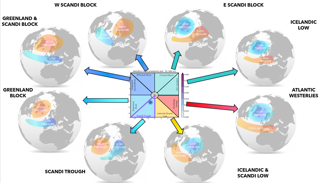
¶ NAO-Blocking Index
This product attempts to categorise weather regimes showing up for ensemble members and plots them in such a way that you can visualise the risk of various blocking/NAO Index patterns through the model time steps. This type of index is more detailed than the NAO Index as it also includes the blocking index which describes the presence/absence of blocking high pressure around the Scandi region. This index is available for EC Ens, GFS Ens, CMC, EC46 and EC Seasonal. In addition, a 7 day aggregated version will show for EC Ens, GFS ens, CMC and EC46 (7 days back not forward).
_1.png)
The individual segments of the above plot are described in terms of their pattern in the diagram below:
¶ Market Mover (Forecast of Forecast)
This is MetDesk’s forecast of the forecast for the next 00z and 12z EC and GFS model runs for temperature, wind and precipitation. Market Mover analyses the operational run and the ensemble output and utilises the dominant clusters to determine the likelihood of the next run changing direction. This likelihood is translated to a probability, whereby through testing it appears 30 per cent is the lowest value to offer a reasonable signal. In addition, the power of the dominant clusters as predictors seems to increase through model time, so we display the forecast from 144 hours after model initialisation, although the signal beyond that is even better.
The Market Mover quadrant maps show the following:
| Top left quadrant Temperature - Prob of >2° warmer Wind - Prob of >5kt more wind Precip - Prob of >5mm more precip |
Top right quadrant Temperature - Prob of >4° warmer Wind - Prob of >10kt more wind Precip - Prob of >10mm more precip |
| Bottom left quadrant Temperature - Prob of >2° colder Wind - Prob of <5kt less wind Precip - Prob of <5mm less precip |
Bottom right quadrant Temperature - Prob of >4° colder Wind - Prob of <10kt less wind Precip - Prob of <10mm less precip |
_1.png)
The verification product displays the previous forecast against what actually happened. The forecast of the forecast maps are the left and middle columns, whilst the maps in the right hand column show what actually happened. This is not like for like because you are comparing probability with an actual temperature difference, but it does give a good guide to whether the forecast signal was reasonable in each instance.
¶ Observations
¶ SYNOPs + METARs
Observations are taken from SYNOP and METAR stations across Europe. The maps use an interpolation technique to create analyses of temperature, wind and pressure filling in betweeen observed values. The method used for this is the Conpac method, one specifically designed to efficiently deal with the interpolation of discrete data, especially where surfaces and gradients change smoothly in general, while discontinuities still occur.
_1.png)
For temperature, this method is used without any merge towards model output. For wind and pressure observations, a merge towards model output is used, which enables a pattern to be shown across areas of sparse observations including oceans.
¶ Anomaly Maps
This section of maps shows anomalies of various weather parameters vs climate normals for past months, going back to 1980. The data is plotted using ERA5 (ECMWF Reanalysis v5), which is available on a 31km grid. Before the ERA5 data is available for a given month or up to a point part way through a month, the anomalies are built using the data from ECMWF deterministic (operation) runs. The switchover from ECMWF deterministic data to ERA5 data for a given month usually takes place around the middle of the following month.
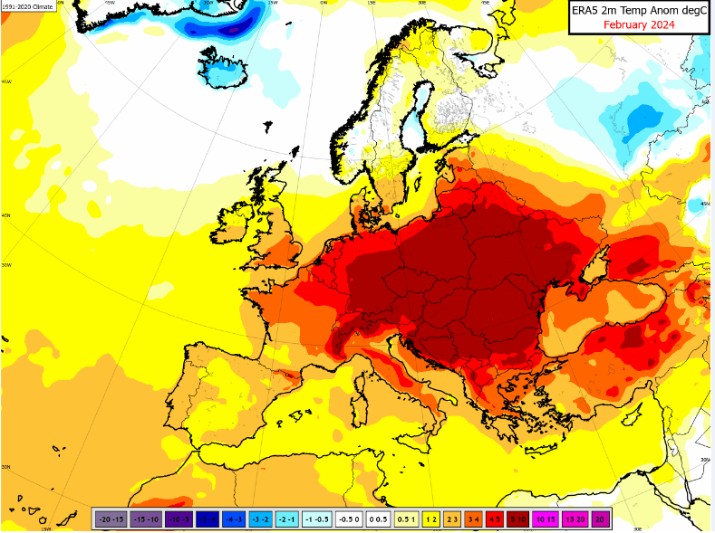
The maps for the current month are updated daily to include the data up to the current day. There are also some snapshots saved daily with the month-to-date anomalies, which can be scrolled back through - see MonthlyAnomDaily.
Daily ERA5 anomalies are also available from the years 2000 to 2021.
¶ Archive Forecasts
This section of the Maps product includes an archive of models runs from EC, GFS and GEM of selected weather parameters going back 1 month, including some aggregate-style charts. This allows users to track how forecasts for a certain time period have changed over a longer period.