MetDesk offer 14-day hourly power demand forecasts, currently available for a selection of European countries, but other countries can be added at request. You can see demand at country and TSO level for Grid, True and Residual demand by selecting Magma (MetDesk) forecasts or the other weather models. You are also able to select between INDO and ITSDO. Climatology, last year and year-2 actuals are also available to compare against, and the temperature graph at the bottom may be useful for proxy comparison with demand forecast.
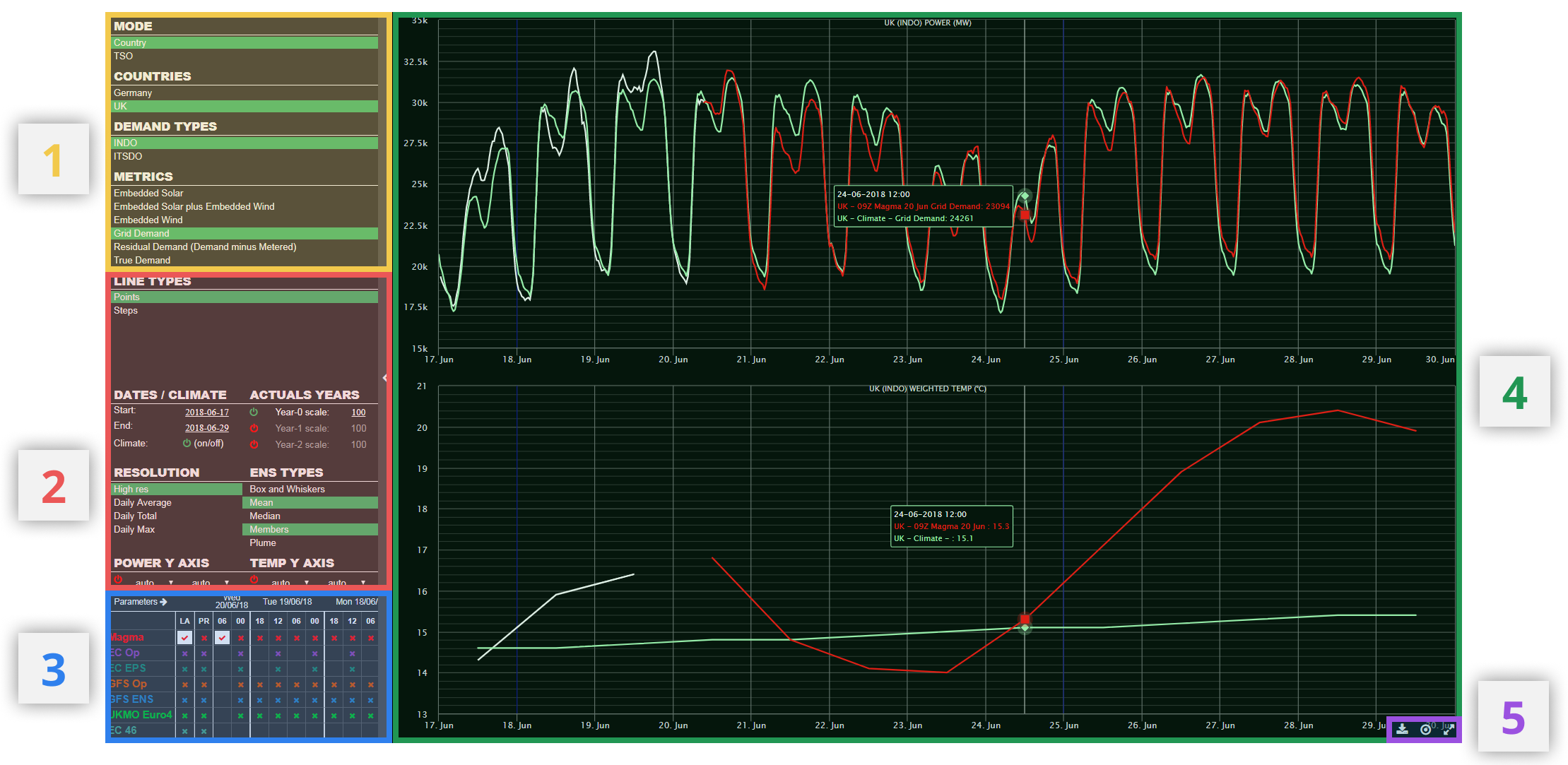
¶ 1) Power Settings
Here, the user can find options to select the preferred country/TSO, the demand type (INDO/ITSDO) and metrics.
Under Metrics:
- Embedded Solar (UK Only) - Unmetered solar generation, not connected to the distribution network.
- Embedded Wind (UK Only) - Unmetered wind generation, not connected to the distribution network.
- Embedded Solar and Wind (UK Only) - Combined unmetered wind generation, not connected to the distribution network. This figure does not include hydro power.
- Grid Demand - Demand to be satisfied from the distribution network
- Residual Demand - Remaining Grid Demand after deduction of metered generation (incl. wind/solar, not hydro)
- True Demand (UK Only) - Grid Demand plus the demand satisfied by embedded generation
Settings chosen here affect both power and temperature graphs in the graph area. All power data is displayed in Giga Watts (GW) and temperature data in degrees Celsius (C).
¶ 2) Display Settings
This part of the page allows the user to determine the way in which the data is displayed on the power and temperature graphs, and select the time ranges of the data shown.
¶ Line Type
The user can toggle between viewing the data in 'Steps' or 'Points'. Using the 'Points' line type, the graphs look smoother, while the 'Steps' type shows each time step discretely and annotates each step with a numerical figure.

¶ Dates / Previous Actuals
Under the Dates / Climate section, the user defines the period of time over which the data is displayed. This can include a period which emcompasses historical data and model projections into the future.

A. Start and End Date Selection.
Click on the date to change and then select the required date from the calendar table which appears (see below)

Once a date is chosen, the x (time) axis of the power and temperature graphs are automatically adjusted.
B. Toggle Climate on/off
This provides the option to turn on/off the power/temperature climatology for the relevant graphs. When selected, the icon (B) will be green and when unselected, the icon will be red. The climate line on the graphs are displayed in a pale green colour.
Under the Actuals Years section, the user can toggle on/off recorded power actuals and observed temperatures (weighted to country/TSO).
C. Toggle Actuals on/off
Here, actuals for power and temperature can be toggled on/off. There are options for the current year (i.e. around present) and 1 or 2 years previous. When the actuals for a given year are selected, the icon (C) will be green and when unselected, the icon will be red. The actuals are displayed as a white line on the power/temperature graphs.
D. Scale Actuals
This option allows the user to adjust actuals (power only, not temperature) by a scale factor in order to account for changes in power demand from the TSO/grid over the course of a year or two, which are not temperature related. Adjusting the scale of one or more of a selected years' actuals can allow the user to analyse based purely on temperature differences between years (see example below). Scaling is done by changing the number (D) for the chosen year (100=default; 90=90% of actuals; 110=110% of actuals/10% higher than actuals).
Model predictions for future demand take into account non-temperature related changes to demand requirements for a particular TSO/country.

Under Resolution, the user can select between High Resolution data (to 15mins in Germany and 30min in UK) and daily values (average demand, maximum demand and total demand).
Under ENS Types, the user can choose the method of displaying ensemble model data, including plumes, all members and box & whisker plots.
¶ Y-Axis Adjustment
Here, the user can independently adjust the y-axis upper and lower bounds for the temperature and power graphs. By default, these upper and lower limits will adjust automatically to encompass the data selected.

A. Reset to default
Y-axis bounds are set to default (auto) if icon is red. The icon changes to green once any changes are made to the upper and lower limits (see below). After changes are made, click the icon to revert back to default axes (automatically adjusting to data selected).
B. Adjust axis limits
Using two dropdown menus, the user can select a fixed lower (left hand menu) and upper (right hand menu) level on both the temperature (in degrees Celsius) and power (in GW) graphs. One of the options in each dropdown is the default 'auto' which automatically adjusts the axes dependent on the range of data selected for the graph.
¶ 3) Model Matrix
The compact matrix enables quick toggling on/off of model runs for demand / renewables forecasts. Simply click a coloured 'x' in the matrix to show all avaible data for the specified model/run. Once selected, the cross will become a tick. To remove the data, click the tick.
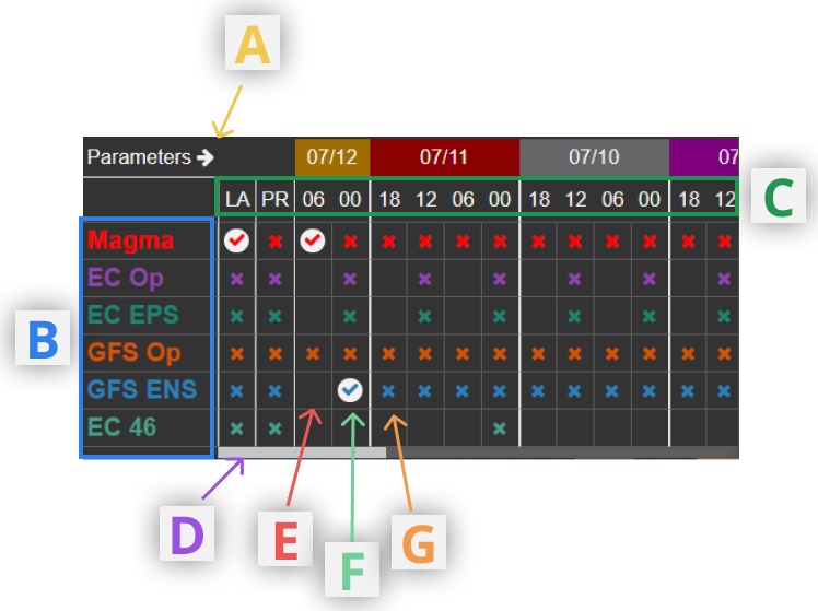
A. Expand matrix
Selecting this arrow icon will expand the model matrix out to the right, enabling the user to view a longer archive of model runs, without having to scroll horizontally. The matrix expands into part of the graph area.
B. Available models
A list of the models available on the Demand Shaoing product. This includes our in-house model MAGMA. Each model is available to be manually adjusted.
C. Run times
A list of the available run times. 6 hourly runs are not available for some models.
LA-Latest Run (select to always show data from the latest available run for a given model)
PR-Previous Run (select to always show data from the previous model run to the most recent available)
When LA and/or PR are selected, the model run shown on the graph will automatically update as new model data arrives.
D. Archive run scroll
Scroll/drag right to view archive model runs back ~10 days.
E. Model run not available
F. Model run available and selected
G. Model run available but not selected
¶ 4) Graph Area

A. Tooltips
When hovering over the graph, these give numerical values for selected model runs, climate or actuals at the date/time the mouse is positioned at/
B. New week markers
These vertical blue lines mark the beginning of each week (Monday)
C. Zoom in
Click and drag right on the graph area to zoom in to a specified period of time. The zoom occurs on both the power and temperature graphs. The minimum zoom period is 24 hours.
D. Toolbar (see below)
¶ 5) Toolbar
The toolbar is found in the bottom right hand corner of the temperature graph area when the user hovers over the graph area
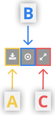
A. Download Data
Download the raw data from the power and temperatures graphs in csv format
B. Toggle tooltips on/off
This setting affects both graphs in the graph area
C. Full screen
View the graphs in full screen mode, removing the left hand panel of the screen including sections (1) to (3). Click the button again to return to the default view.