The power demand shaping tool allows you to manually alter the MetDesk power demand projections. In most case, it is likely that the true or grid demand will be the one to be manually adjusted, but it is also possible to produce an embedded solar or wind forecast. All you have to do is drag the line for each 30-minute interval to where you want it to be. You can then export the data by pressing the export button in the bottom right corner and ingest it into your own internal tools/pricing models. You also have the option to upload previous edits.
¶ 1) Power & Display Settings
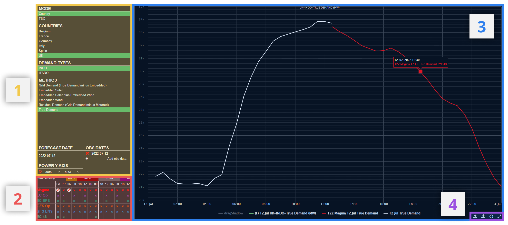
Here, the user can choose the desired power options. Simply select the required setting under the headings of Mode, TSOS, Demand Type and Metric. Only one selection is possible for subsection.
Under Metrics:
- Embedded Solar (UK Only) - Unmetered solar generation, not connected to the distribution network.
- Embedded Wind (UK Only) - Unmetered wind generation, not connected to the distribution network.
- Embedded Solar and Wind (UK Only) - Combined unmetered wind generation, not connected to the distribution network. This figure does not include hydro power.
- Grid Demand - Demand to be satisfied from the distribution network
- Residual Demand - Remaining Grid Demand after deduction of metered generation (incl. wind/solar, not hydro)
- True Demand (UK Only) - Grid Demand plus the demand satisfied by embedded generation
¶ Date Selections
Further down the settings panel there is the option to select the date of forecast/observations to be displayed on the graph. The graph will only show a 1 day / 24 hour period, from 00Z to 00Z, unlike the Power Demand Forecast product which will show several days on one graph. Select the forecast date by selecting the date under the heading and choosing from the pop-up calendar (as with obs dates in image below).
There is also the option to plot on observations from a historical archive of dates, in addition to the forecasts, for comparison.

A. Select Date
Click on any of the currently shown dates to change to a different date on the pop-up calendar
B. Remove obs graph
Click the red 'x' next to the observation graph to remove it from the graph area
C. Add obs graph
Click to add a new obs date (up to 11 possible). Follow step A to choose date.
¶ Y-Axis
Here, the user can independently adjust the y-axis upper and lower bounds for the power graph. By default, these upper and lower limits will adjust automatically to encompass the data selected.

A. Reset to default
Y-axis bounds are set to default (auto) if icon is red. The icon changes to green once any changes are made to the upper and lower limits (see below). After changes are made, click the icon to revert back to default axes (automatically adjusting to data selected).
B. Adjust axis limits
Using the dropdown menu, the user can select a fixed lower (left hand menu) and upper (right hand menu) level on the power (in GW) graph. One of the options in each dropdown is the default 'auto' which automatically adjusts the axes dependent on the range of data selected for the graph.
¶ 2) Model Matrix
The compact matrix enables quick toggling on/off of model runs for demand / renewables forecasts. Simply click a coloured 'x' in the matrix to show all avaible data for the specified model/run. Once selected, the cross will become a tick. To remove the data, click the tick.
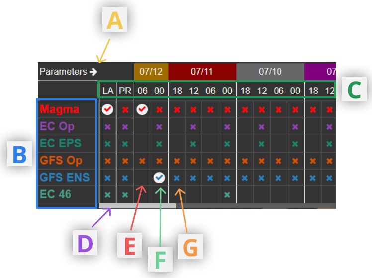
A. Expand matrix
Selecting this arrow icon will expand the model matrix out to the right, enabling the user to view a longer archive of model runs, without having to scroll horizontally. The matrix expands into part of the graph area.
B. Available models
A list of the models available on the Demand Shaoing product. This includes our in-house model MAGMA. Each model is available to be manually adjusted.
C. Run times
A list of the available run times. 6 hourly runs are not available for some models.
LA-Latest Run (select to always show data from the latest available run for a given model)
PR-Previous Run (select to always show data from the previous model run to the most recent available)
When LA and/or PR are selected, the model run shown on the graph will automatically update as new model data arrives.
D. Archive run scroll
Scroll/drag right to view archive model runs back ~10 days.
E. Model run not available
F. Model run available and selected
G. Model run available but not selected
Note that individual ensemble members are not available to view on the graphs in the Shaping product, so ensemble average are shown instead.
¶ 3) Graph Area
This panel displays the data selected in the menu bar to the left of the screen. Here is where the user can manually adjust (using a mouse) one of the selected graphs in the graph area. Using the option in the toolbar, the user can download their manually adjusted data or upload previous edits.
¶ Shaping

To manually shape a graph, there are three steps:
A - Click
First click on a point on the graph which is to be shaped. It is only possible to manually adjust one forecast or observation graph at a time.
B - Drag
Drag the selected graph in the direction required. Dragging up/down on the screen (as in graph 1 above) will move one individual point on the graph (i.e. one hour), while dragging with some horizontal movement will move whole sections of the line at once (see graphs 2/3 above). The direction of dragging determines the shape of the manually adjusted graph. While dragging is in process, a drop shadow will mark the initial location of the graph (see below).

C - Release
Release to mouse click to save to manually adjusted line.
Once the user has dragged one of the graphs, it is not possible to alter any of the other graphs (either model forecast or archive observations) shown.
To reset the manually adjusted line, click on the forecast (F) entry in the legend at the bottom of the graph area (highlighted below). Once selected, the user can then re-start the manual adjustment process on any of the graphs.

¶ 4) Toolbar
The toolbar is located in the bottom-right of the graph area, visible when the mouse hovers over the graph area.

A. Upload data
The user's manually adjusted forecast will not be deleted in the same browsing session but will not be seen in a new session. If required, the forecast can then be downloaded and then re-uploaded into the new session by clicking here and selecting the revelant csv file.
B. Download data
This option allows the user to download all the data from the graph area into csv format to their local computer.
C. Tooltips
Toggle tooltips on/off. Having tooltips off may reduce interference with the forecast graph adjustment.
D. Full Screen
View the graph in full screen mode, removing the left hand panel of the screen including sections (1) and (2). Click the button again to return to the default view.