Trading Weather is compatible with mobile devices so can be accessed on the go. Because of the complexity of the various products, there are some limitation in terms of displaying the data compared to the full desktop version, but the data feeding in is exactly the same.
The user experience is best when using the landscape orientation on mobile.
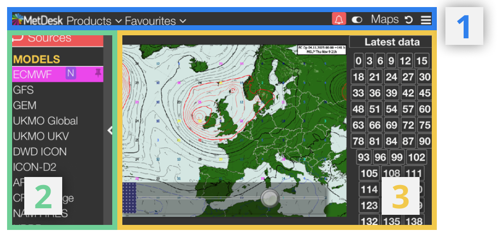
1. Menu Bar
2. Panel
3. Timebar + Main Product View
¶ Additional Features
There are a few features that are specific to the mobile version of the site and some that are particularly relevant to navigating the site via mobile or tablet...
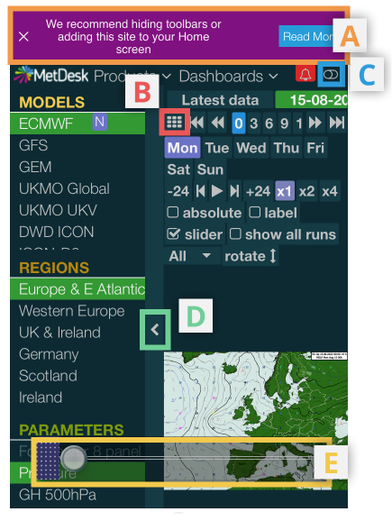
¶ A) iOS Mobile Optimisation Options
When opening a tab of Trading Weather on an iOS mobile browser, a panel at the top of the screen directs the user towards further information on two ways to improve accessibility of the site:
- Adding a laucher icon of Trading Weather to the homescreen of an Apple device. This effectively creates a 'micro-site' version of Safari that can be launched directly from the homescreen and solely operates Trading Weather, thus not needing URLs, toolbars etc, which increases the on-screen experience for maps and charts. Select 'Add to Home Screen' from the options menu in Safari.
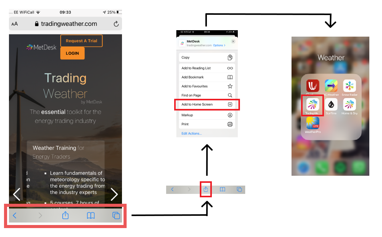
- Hide the toolbars in Safari, minimising the browser's interface.
Pressing the cross to close the panel will be remembererd by the browser's cookies.
Switching the device's setting to use 'landscape' view will also aid the viewing of some of TW's products.
¶ B) Time Step Select
Pressing this button brings a pop-out menu with each of the available time steps, as an alternative to scrolling horizontally through the time bar.
¶ C) Simple vs Desktop Mode
Due to the reduced screen size of a mobile / tablet device there is the option to switch to a simpler method of navigating the panel to the left hand side of the screen.
.png)
When in Simple mode, instead of many menu options (e.g. Region, Element, Model Source) all being displayed at once in the panel, the user can scroll through these one at a time using the top button in the panel.
Using the indicated button to the top-right of the screen, the user can toggle this mode on/off.
¶ D) Hide Panel
Given the reduced screen size, the feature to minimise the panel can be particularly useful.
¶ E) Slider
The slider allows the user to control scrolling through time frames using a sliding button. The location of the slider can be moved around the screen using (i), while pressing and holding button (ii) provides the main functionality of changing time frames.
.png)