The Temperature Watch product enables to user to compare MetDesk's MAGMA temperature forecasts with previous forecasts or observations. Viewed either in colour coded tables or graphs with deltas, the hourly MAGMA forecasts from the most recent couple of days can be compared with each other (until Day+3) and the latest site specific temperature observations as they arrive.
Details about MAGMA itself can be found in the MAGMA tables product documentation here.
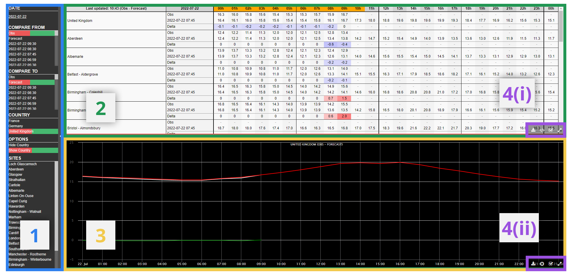
¶ 1) Menu Bar
In the Menu Bar, the user can select the data to populate the table and graph. By default, changes made in the Menu Bar will alter both the table and the graph, but changes to individual graphs can be made by first selecting the desired panel. This can be done by using the relevant button in the toolbar (see section 4). Each of the graphs are colour coded, so it is easy to see which settings are selected for each graph in the panel.
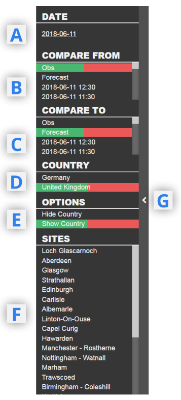
A - Date selection. Click here to choose the 24 hour period (00Z-00Z) to populate the tables and graphs
B/C - Compare from / to. Select the MAGMA forecast initialisation times or observations to compare in the tables and graphs. The selection from B will always be shown above C in the table and the deltas will be calculated as (B-C).
D - Country Select. Toggle between United Kingdom, France and Germany forecasts/observations.
E - Show/hide country. Toggle on/off the option to show a weighted country average of temperatures in addition to the site specific temperatures.
F - Sites Select. Choose the sites to be included on the graph. All sites are included in the table regardless, but those selected here are moved towards the top of the table.
G - Hide Menu Bar
¶ 2) Table
For each location and/or country wide option selected, there are three rows in the table. The first includes data from "Compare From" (B), the second from "Compare To" (C) and the third is a delta between the two.
Data values are given hourly. Be aware that for the hours preceeding the initialisation time of a MAGMA run will default to the observations, so when compared to observations themselves will show a delta of zero.
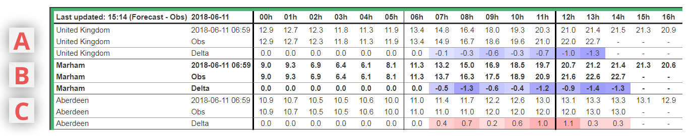
A - Country wide temperatures (toggle on/off in Menu Bar 1E)
B - Site specific location selected. Toggle selected sites in Menu Bar 1F. Those sites selected are shown in bold in the table and moved to the top (below the country wide).
C - Site specific location unselected. Those sites within the country that are not selected for viewing on the graph. By default these are in alphabetical order.
The toolbar in the bottom-right part of the panel is described in section 4.
¶ 3) Graph
This panel visually displays the data from the table above, although only includes those sites selected in the menu bar. By default, 24 hours of data are shown, but the user can zoom in on the x (time) axis by clicking on the graph at the desired starting point and dragging towards the desired end point. Deltas are shown using a green line, observations using a white line, and forecasts using a red or blue line.
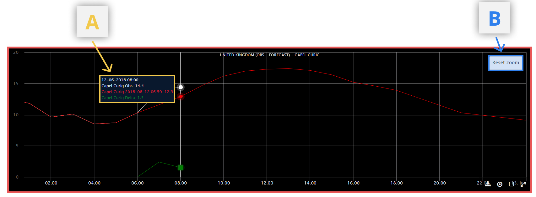
A - Tooltips
Hover over a point on the graph to view numerical data for each graph at that hour
B - Reset Zoom
Only shown if user has zoomed in on the x-axis.
¶ 4) Toolbars
Given there are two different types of chart in this product (graph and table), the toolbar also varies between the two.
¶ 4(i) Graph Toolbar
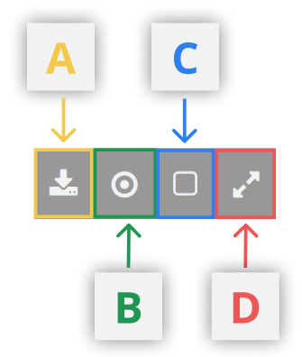
A - Download data.
This downloads a CSV file to the user's local computer containing all the data displayed on the table/graph.
B - Toggle Tooltips on/off.
C - Select/Deselect Graph. For use when viewing different datasets on the table and graph.
View the table in full screen.
D - Full Screen
View the graph in full screen. To return to the original view, select the same button on the right of the toolbar again.
¶ 4(ii) Table Toolbar
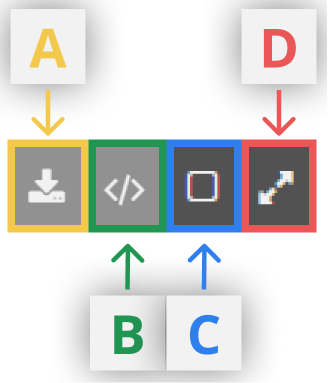
A - Download Data (csv)
Download the raw data from the table in csv format
B - Download Data (xml)
Unlike option A, this format is more easily viewed with styling in spreadsheets
C - Select table
For use when selecting datasets between the table and graph parts of the screen.
D - Full Screen
View the table in full screen. To return to the original view, select the same button on the right of the toolbar again.